|
字体设计三要诀 三联 你对头图的文字的设计配比有过研究么? 你相信文字的设计可以为整个头图加分 ...

你对头图的文字的设计配比有过研究么? 你相信文字的设计可以为整个头图加分么? 你曾经为了杂志风格的页面懊恼过么? 你对传说中的大气崩溃过么? 如果你的答案是 YES!那么就跟着我往下看吧! 希望这篇文章对你的设计有所帮助! 文章作者为@张鑫_是巨蟹座滴 ~~Ps:是个漂亮的妹子哟  设计中的文字应该避免繁杂凌乱,应该叫人易识别、易了解,最最忌讳的是为了设计而去设计,忘记了文字本身的目的是为了更加有效的传达意图,表达设计和主题构想的融合……  我们来举个栗子吧! 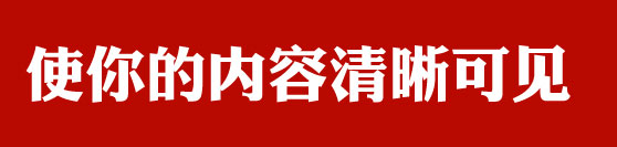 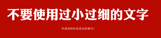 避免使用不清晰的字体,否则容易使人产生反感和麻烦(除非你需要那种效果)  恰当的选择你所需要的字体、 但是,经过特别处理,你可以使用一些本来并不合适的字体 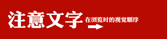 在制作图片时,要注意文字的排版顺序 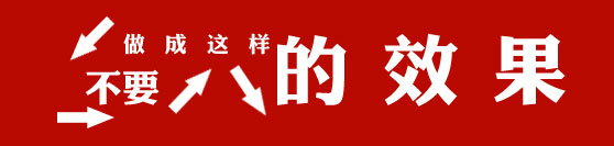 切记一定要按照正常的阅读顺序来排版,如果顺序混乱,是会对阅读效果造成影响的。 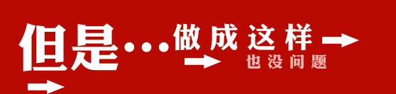 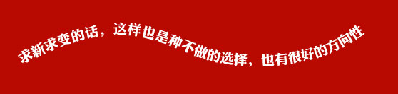 7 N" B: l0 M" N& `9 [* ^ 7 N" B: l0 M" N& `9 [* ^
| 
 35695
35695 0
0


 ©2015-2022 tuyuanma.com 版权所有 Sitemap.xml


 开发工具
开发工具
 站长平台
站长平台
 IDC服务商
 注册交易
注册交易
 SEO及安全
 开放平台
开放平台
 CDN及SSL
 源码资源
源码资源
 自媒体平台
自媒体平台
 图片工具
图片工具
 小程序平台
小程序平台
 投资理财
投资理财
 常用工具
常用工具
 友情链接
友情链接
 网络硬盘
网络硬盘


 赣公网安备36112102000036号
 赣ICP备17001544号-10